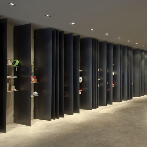
Toys are displayed between steel fins at this second-hand shop in Andorra by Miquel Merce Architect and MSB Workshop.
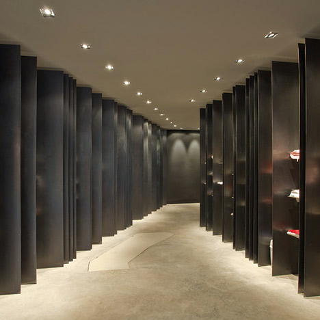
Called Món Petit, the space is also used as a meeting place and to host workshops.
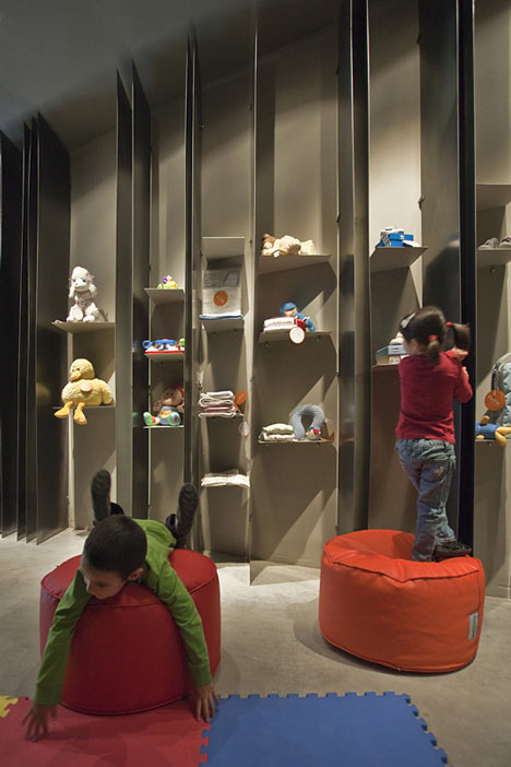
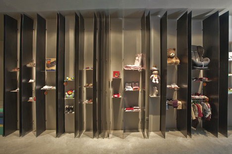
Items for sale are displayed between the vertical recycled-steel plates.
More stories about retail »
The following information is from the architects:
A store more than just a store. A singular shop, not only for its premiere in Andorra as a sustainable space of pre-owned baby items, but also for its expressive and sincere architecture.
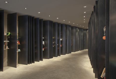
This shop come into being in a specific period: crisis, ecology, sustainability… a set of factors that makes us react and change. Retrieve, save, consider, are verbs that we have to go along with in this new phase, and demonstrate that they are not only a philosophy of a minority, but they should be the philosophy of everyone and everything.
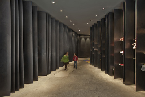
More than a store: here the customer brings the product, making it complicit in this new concept, where fashion and marketing becomes necessity and reality. Opening up endless possibilities, in terms of volume and sizes, of products on display. First difficulty: flexibility, it should be possible to expose both small and large items, in varying amounts without having to turn constantly the space.
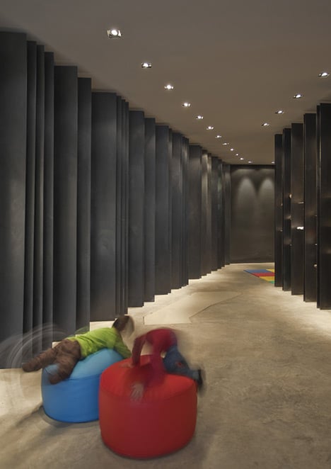
Any product intended to children has striking colours, shapes, motifs… that concentrated in such stores are intensified up disconcerting. In many cases, this visual intensity plays against the order and serenity of the space, the content can “beat” the container. Second complexity: the space must control children’s products usually striking.
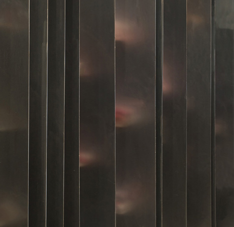
We respond to this problematic creating a single item, which transmit this philosophy of sustainability, and natural recovery. It doesn’t want to be furniture, but to be immaterial, sculptural and essential. We create an element that, like everything else in this space, can be reused, giving him a second chance, without adornment or gimmicks, without irreversible manipulations … It is not decoration or vogue; it is sincerity, philosophy… Architecture.
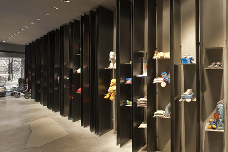
Those elements are recycled black steel plate, chosen especially for this space for its elegant and evocative dark texture. Pushed to the limit of their strength, those plans give the sensation of “floating” lightly in space, helping to create a special and unique atmosphere.
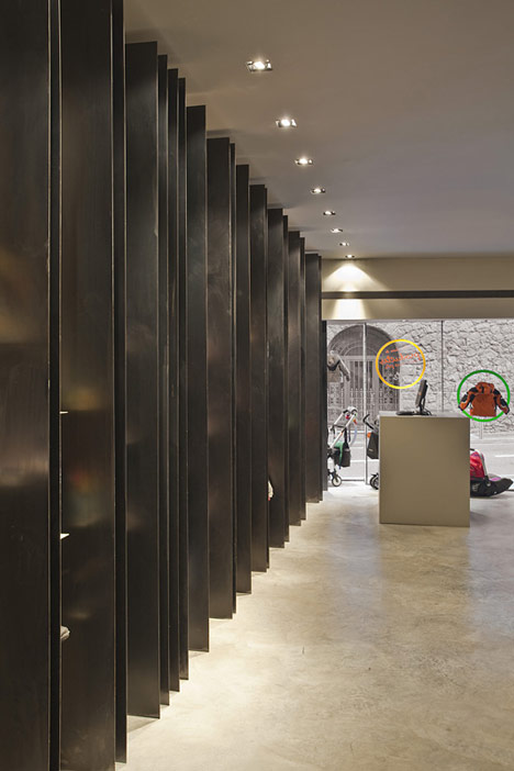
Thanks to its constructive and material sincerity, it enhances the value of the products exhibited. With its repetition, it gives rhythm and vibration to space. Opaque and heavy laterally, invisible and clear front side, the steel elements metamorphoses dramatically forcing the viewer to move, to change perspective, interacting with it. It is a geometric reality: to see all the products, the customer is forced to enter and go at the back of the store, participating and living this sculptural architecture.
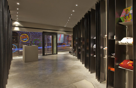
Mixed with this trading area, there is a space for kids and parents, where meetings, conferences, workshops are possible to emphasize even more this idea of interaction with space, mixture client/seller, and new philosophy of sustainable trade.
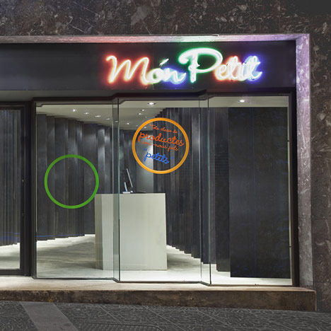
In short, we wanted to create a sculptural space, useful and critic of the times we live in, doing with the minimum, the maximum, giving a new sustainable dimension to the “less is more” of Ludwig Mies van der Rohe. A space formed by a repetition of reusable elements with sculptural rhythm, that beyond a commercial or environmentalist discourse wants to bring it spectator into a architectural world where elegance and sustainability works; Where necessity and art mingle; where things can have other uses, and still make us vibrate for its naturalness. It is not interior design or decoration, is a change in our society, our way of thinking and seeing things,a change in our time, in short, Architecture.
Miquel Merce Architect + MSB workshop office Andorra, October 2010.
Name: Món petit
Location: Av. de les Escoles no5 Escaldes-Engordany ANDORRA
Program: Commercial and meetings space
Surface: 60m2
Architectural project: Miquel Merce Architect + MSB Workshop office d’arquitectura i disseny
Fotography: Miquel Merce Architect
Graphic design: BAG Disseny Constructor: Lizarte Blacksmith: Cortals
No comments:
Post a Comment