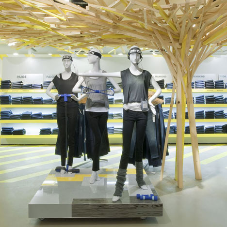
London studio FAT have completed the womenswear department of London department store Selfridges using angular structures and painted floor patterns in clashing colours.
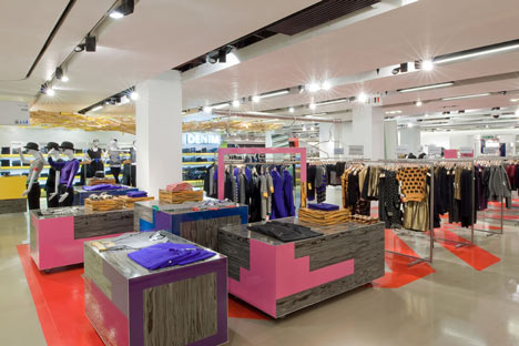
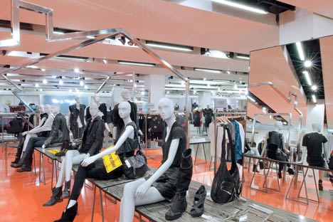
Called Selfridges 3rd Central, the interior features blocks of colour, a column of wooden batons spreading outwards as it meets the ceiling and sharply angular metal rails.
Photographs are by Andrew Meredith.
The information below is from FAT:
Selfridges 3rd Central
FAT have completed the design of 3rd Central, Selfridges new contemporary womenswear department in the landmark Oxford Street store.
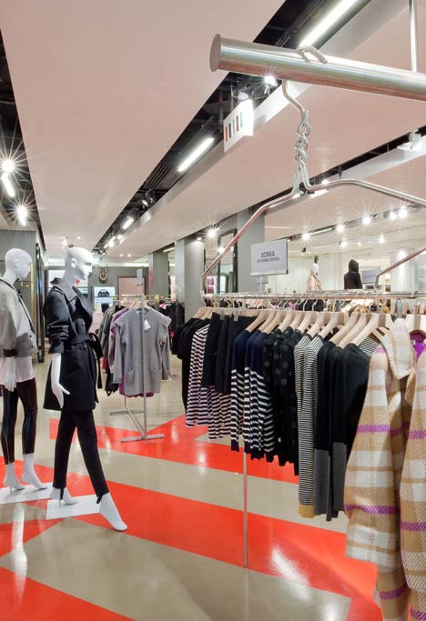
The project uses supergraphic patterns, Pop detailing and a strange sense of scale to create an exciting and engaging environment.
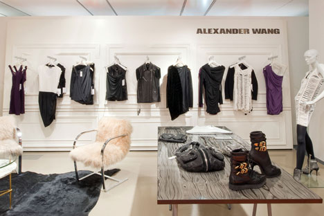
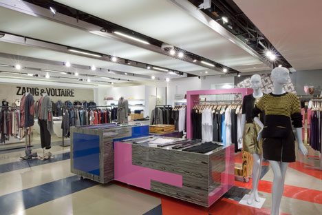
“It’s about making it as little like a traditional shopfit as possible – so that everything feels more like an installation than an interior,” says FAT director Sam Jacob. “This gives the whole floor a kind of rawness that makes it feel very different to the usual glossy department store environment.” The space is characterised throughout by painted floor patterns recalling abstracted and overscaled industrial markings. Tables and plinths using psychedelically dyed wooden laminates paired with flat Formica develop a consistent language linking the varied areas.
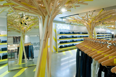
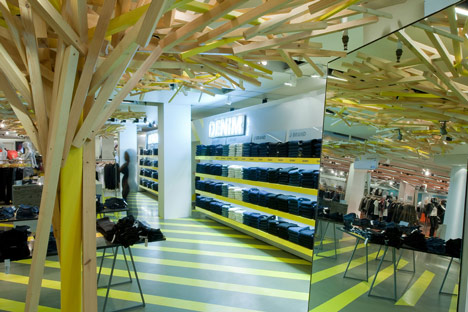
The 2,310sq m floor is organised around three main areas. The first is a 26m denim wall – Europe’s longest. Here a canopy, formed by a seemingly chaotic explosion of timber struts frames the space. Both raw and expressive, the canopy plays against a background of sharp graphic legibility formed by the denim shelves. Visual languages of direct pragmatism and more glamorous theatricality are combined to explore the dialogues of workwear and luxury that run through contemporary denim design.
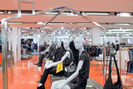
Selfridges’ Basics area plays on the idea of ordinariness exaggerated into something strangely special. A series of overscaled coat hangers become a surreal means of display. Giant sized clothes hangers are used for normal sized hangers to hang from. Pop-graphic plinths take on the characteristic of abstracted shipping crates. The Contemporary space, which introduces new designers to the floor, is defined by an orange poured resin spill that looks like a beautiful accident. A chromed frame outline of a house creates a flexible, customisable space that works like a shop-within-a-shop, allowing brands and designers to take ownership of the space.
Around these anchor points brands including Vivienne Westwood, Alexander Wang and Zadig and Voltaire respond to FATs design guidelines. Giant billboards apparently lean against the perimeter wall, providing a consistent horizon to the space.
No comments:
Post a Comment