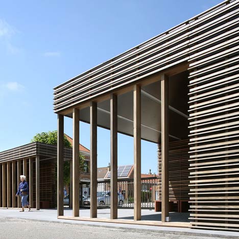
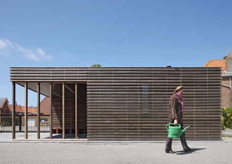
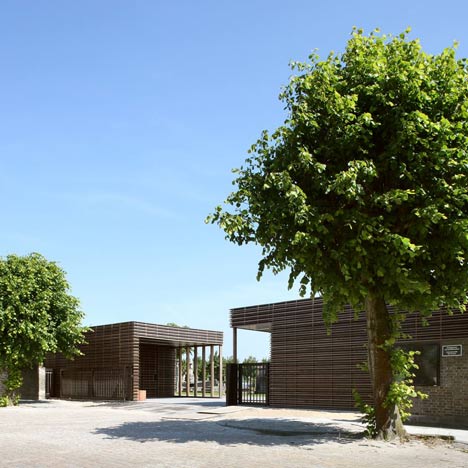
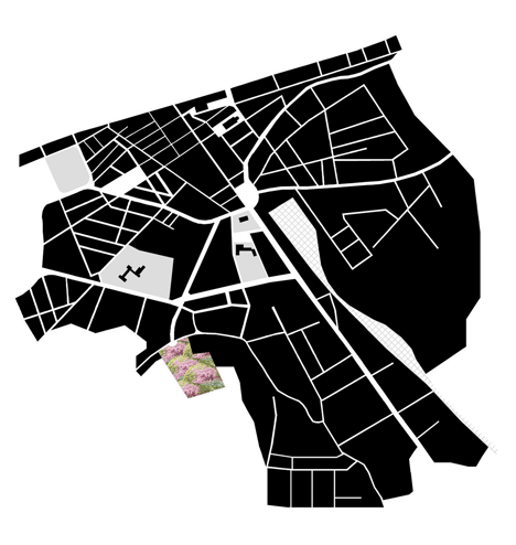
This pair of pavilions by Dutch studio Hansteerds Architectuur mark the entrance to a cemetery in the city of Blankenberge, Belgium.
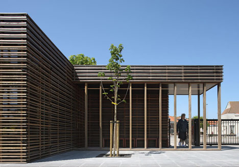
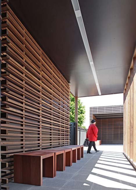
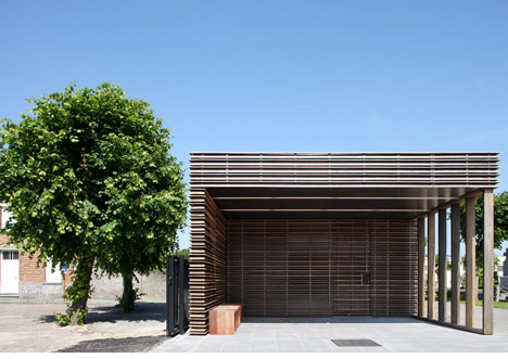
The pavilions have a wood-frame construction clad in horizontal slats made of paudak wood.
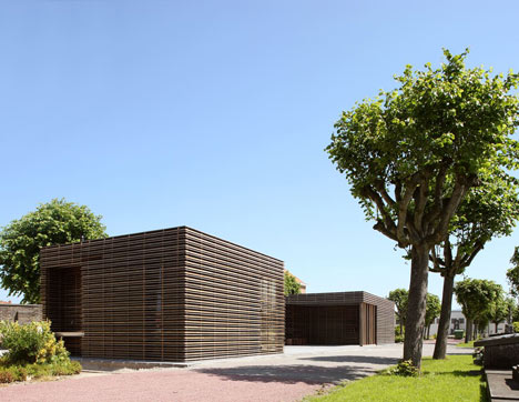
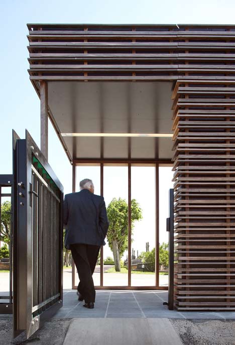
The pavilion on the left as visitors approach is a public toilet while the other, on the right, forms an office and colonnade with benches overlooking the cemetery.
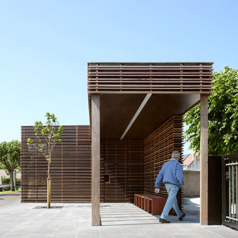
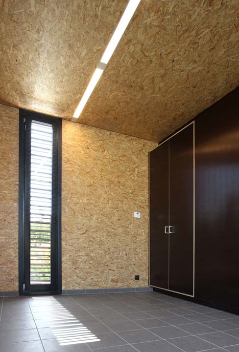
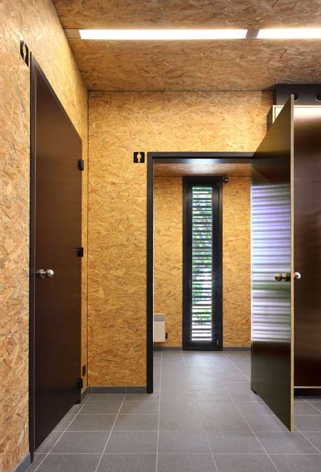
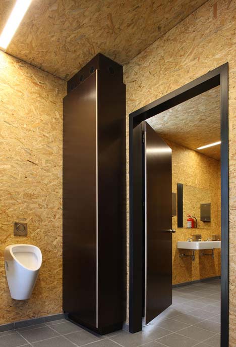
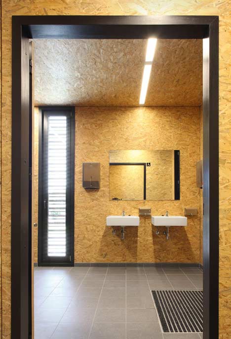
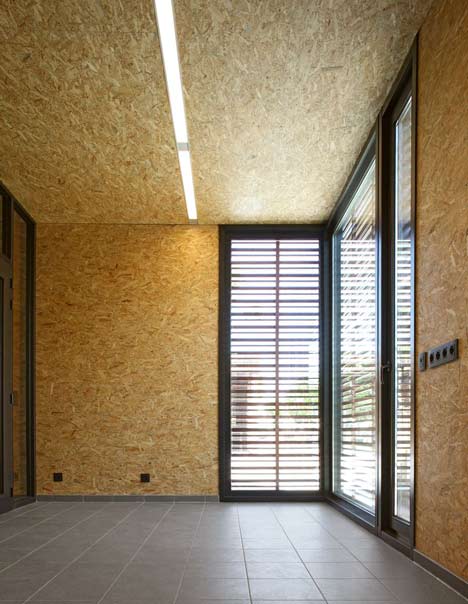
The interiors are finished in oriented strand board with the doors, cabinets and windows painted black.
All photographs are by Philip Dujardin.
Here’s some more form the architect:
Two big houses mark the left and right side of the square in front of the municipal cemetery of the city of Blankenberge in Belgium.
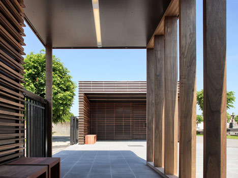
The two characteristic buildings rise high above the curved walls, which separate the cemetery from the square.
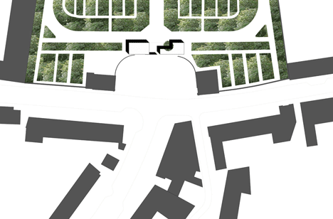
The square seems symmetrically, mirroring on the central axis of the graveyard, which stretches from the porch on the square towards the open landscape on the other end of the cemetery; a balanced and distinguished composition.
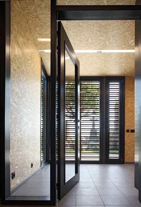
A new pavilion is build at the entrance of the cemetery by the Dutch architect and urban designer Hans Teerds.
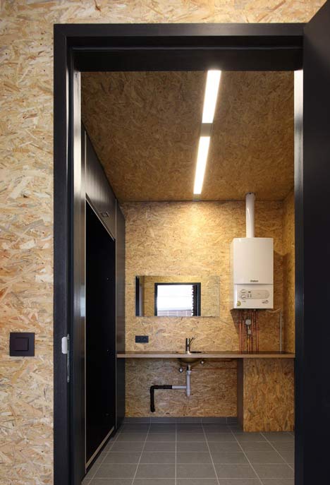
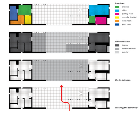
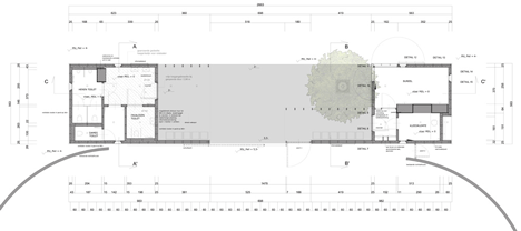
The pavilion houses a small office, a clothing room for employees and public toilets. Teerds split the program into two buildings, which were situated on each side of the axis, in-between the curved walls and the first side-paths.
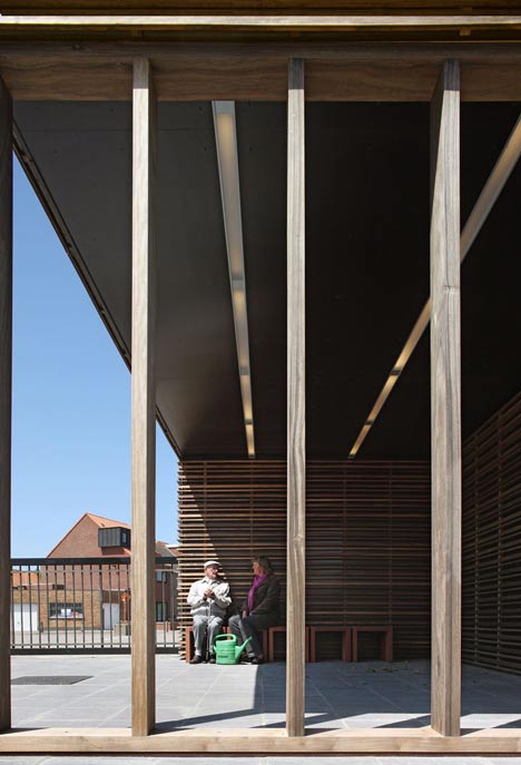
The space in-between both pavilions is partly covered, on the side of the square and city enclosed by a façade, on the other side separated from the graveyard with a row of columns (which delivers the image of a colonnade and opens the view towards the cemetery) and by a new chestnut tree.
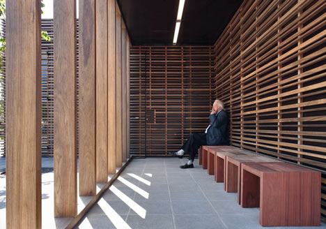
With its benches, the in-between space delivers room to sit, wait and meditate, looking through the columns into the graveyard.
Sunlight delivers nice patterns of the columns on the floor and façade; the flow of the times becomes experienced.
Thus the in-between space marks and intensify the moment of entering by situating the most public area at the very entrance and moreover by evoking the sensibility of the visitors.
Both pavilions are built in wood. The facade is an open casing of horizontal padouk laths, which covers the whole outer form of the pavilions – also covering doors and windows.
On the one hand, this delivers the pavilions an abstract but sculptural appearance, which is the critical mass that is needed to form the entrance.
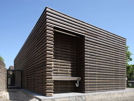
On the other hand, the pavilion redirects the attention towards the things going on around the entrance, mostly because of its silent character.
The similarity of both buildings strengthens the composition of the two pavilions as a whole, which also clarify the importance of the in-between space.
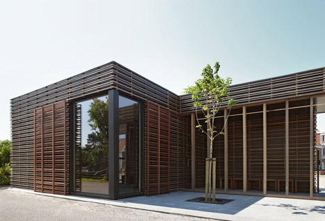
The wood will change from colour during the first initial years, from deep red towards gray, which helps the pavilions to become rooted in the cemetery, to become one with its surroundings.
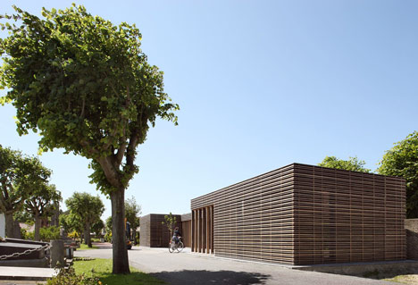
The wood also softens the hard forms of the pavilion and the straight lines of the façade, through its organic structure and imperfect form, colour and appearance.
The interior – walls as well as ceiling – is covered with plywood, which combines nicely with the white porcelain of the toilets, rusts free steel accessories, black doors, cabinets and door- and window frames.
Through the windows, again the laths of the façade determine the view and deliver a nice play of sunlight and shadow on the walls and the floor.
Architect: hansteerds architectuur, Amsterdam, (NL)
Project architect: Hans Teerds
Accompaniement: Johan Louagie, Bruges (B)
Client: City of Blankenberge, Blankenberge (B); Patrick De Clerck, Guy De Vos, Kurt Vanoosterhout, Kristof Jacobs, Sigrid Pinnoy
Contractor: Axis Bouw, Loppem (B)
Structural Engineer: Stedec, Roesselare (B)
Safety coordinator: Archiline, Bruge (B)
Building costs: € 188.433,-
Photographer: Philip Dujardin, Ghent (B)
No comments:
Post a Comment